
Give Some thought to the Color Palette and the Effect Can be Remarkable
Every time you decide to paint, a major decision is going to be how to use color. This is not as simple as use a dark blue for the sky or make a red piece a purple piece; those are selective choices inside a bigger arena. What I am talking about is are your values, the lightness and darkness of your colors, going to be concentrated in the lighter values, the middle, or a broad range, or are you going to use very bright intense colors, grayed colors, or a stark light and dark palette. This color decision is very important and one that is overlooked in the paintings of the painter who is just reproducing the perfect photo. In this world a big decision is to change the color of the trashcan from blue to dark blue, wow not that’s creative.
In this lesson I will be painting the same wonderful sunlit New England building, each time handling the color and values differently. I think you will see how the changing of the color palette and the contrast of value can really make a huge difference in the mood and feeling of your painting.

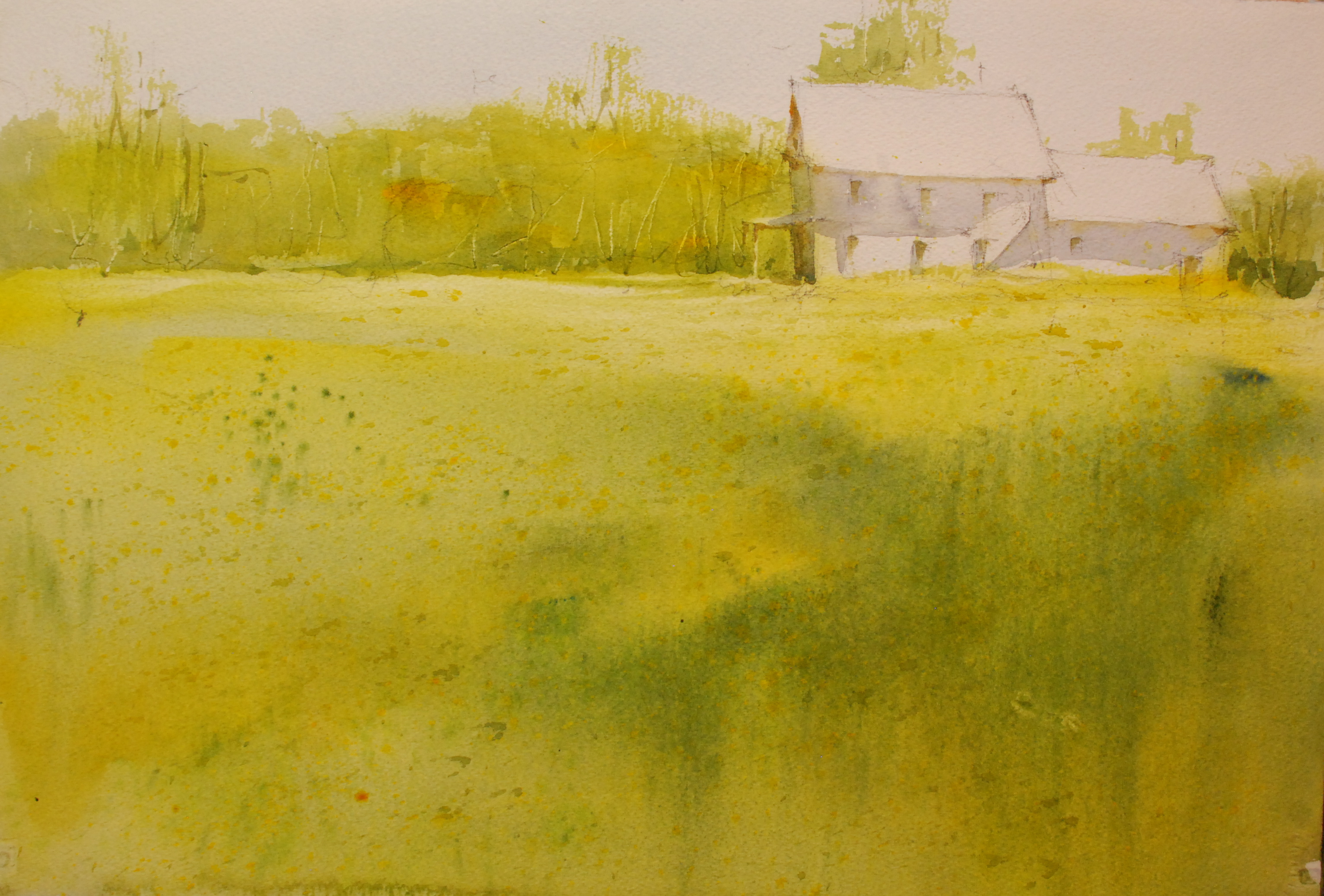
In the first painting I have used a very narrow value range and focused on early spring light greens and yellows. The shadow on the building is a very light value mixed from Cobalt Blue, Cobalt Violet and a hint of Raw Sienna. Since it is a white building I want the shadow to look white and I really tried to get a feeling of the warm bounce light that would be visible with this much sun on such a clear day. I accented the feeling of sun with the warmth in the windows. The green on the trees and in the foregrounds were mixed with the same colors, Hansa Yellow, New Gamboge, Cobalt Blue and some Raw Sienna in the details of the tree trunks. I scraped out the Trees with a small penknife. The foreground gradation is a warm mix of Hansa Yellow, New Gamboge, and Cobalt Blue with Olive Green mixed in to the field on the right. I splattered wet Raw Sienna and Burnt Sienna into the field with a round brush when the colors were still wet.

Remember to keep the values of the painting light, to use vibrant colors, to really pay attention to the lightness and the color of the shadow this color is not purple or a flat lifeless grey.


For the second painting I have chosen a more neutral color palette, Burnt Sienna, Ultramarine Blue, Raw Sienna, Cobalt Violet. The value range of the painting is much darker and is more focused in the middle ranges. I will be using very little white although there will be the occasional highlights around the painting. I decide to add some water to the painting and from the very start I know I want to have a real dark agitated edge at the waterline and I make sure that I apply the paint with the side of my brush to get a nice active edge.
There is much more brushwork in the foreground and I have put a lot more interest in the lower portion of the painting. I think it would be really boring if it were a graded field like in the first painting.
The building is a mix of Ultramarine Blue, Burnt Sienna with some Raw Sienna to warm up some of the walls. I painted around the one window to give the effect of being able to see through the window. I textured the roof with a light mixture similar to the color on the walls, I use the side of a round brush to apply the paint and then splattered some color on it to give some details. Where the trees meet the dark side of the building I lose some edge between the building and the trees and cut around some little highlights to give the painting depth. I also cut around some random shapes at the bottom of the facing wall of the build again this gives that area some strong depth. Working in grayed colors is not easy; first if you don’t remember to vary your colors the mixtures will be boring, and if you rub the paint too much you will get very flat and uninteresting passages of color. Remember to grade your major shapes and to vary your details, brushwork and colors. A grayed color palette can produce a boring painting if you don’t put enough effort into subtle changes. It requires a very thoughtful approach but can result in very nice paintings. Just look at Andrew Wyeth.

In the third version, I am trying to get a very strong stark feeling of light. Using a value range from lightest light to darkest dark and very rich colors with lots of active brushwork and scraping, I have produced a much more powerful painting. The light jumps off of the paper. The shadow on the house is a touch darker but is still transparent and I made it using the same mixture I used in the first version, Cobalt Blue, Cobalt Violet, and a hint of Raw Sienna. I occasionally will use some Cadmium Scarlet to gray the mixture and it adds a nice warmth. After running the cast and form shadows on the house I dropped in some Raw Sienna at the top of the shadow and let it bleed down into the wash. I think I went a little too far but better some than none. On the left side of the house, with the porch, I have lightened the shadows and put more warm colors in. This gives a much better feeling of bounced light. Note the pieces of white paper I have left at the bottom of the tree line this both adds interest and a sense of depth.

The foreground is painted with very rich middle valued colors, which are heavy on pigment and light on water. Too much water and the colors will be too diluted and weak. I made a big change in color across the foreground from very rich Raw Sienna on the left with a touch of Sap Green, and in the middle I moved the mixture to a dominance of Sap Green and then back to a more Raw Sienna/Sap Green mixture on the far right. The bottom of the painting is a mixture of the field colors plus Ultramarine Blue, and Burnt Sienna and this is applied with very little water and very aggressive brushwork. I scraped out the weeds and rocks with a scraper and a knife. A point to remember is that when I put together these mixes I am not over brushing them on the palette creating a one dimensional boring mix, but rather I am just mixing them a little and trying to preserve each color as a distinctive part of the mix. Try not to over mix your colors and you will have more vibrant and translucent washes.


The last version of the house is light filled but the colors are very warm and summery. The trees in the background have a more modeled feeling than in the previous versions and the value range is very wide. The brushwork in the back of the painting is supported by the amount of detail in the foreground. This is necessary if you want the background to stay in place and not come forward. The heart of the painting is in the foreground with its scattered pieces of light and active brushwork. The paint was applied with the side of a number 16 round brush, I use a Silver Black Velvet brush they are great and fairly inexpensive. I really moved the brush along and varied the color and angle as much as it made sense. Too many direction changes and the foreground will get very confusing. I splattered a few darks in and scraped the smaller weeds. The shadows on the house are the same mixes as before but I did shorten the shadows. The tree line behind the house was started with New Gamboge and I added cool dark greens on top of the yellow the get a strong-modeled form. The rich warm tones in the trees are a mixture of New Gamboge, Raw Sienna, and probably Cadmium Scarlet.
The trees were painted in one continuous process, no time out for drying. Just keep using less water as the process goes on and keep changing the color and brushwork. I scraped the trees out with a knife and added some dark details with a number 6 Script Liner also from Silver Black Velvet line.
I hope you enjoyed this lesson on how changing the color and values can really add to your interpretation of a repeated subject. If you like a theme, get some mileage out of it and really let go of the one approach is the best attitude.