Home
Blog
Jumpstarts
Daily Demonstrations
• Lessons Step-by-Step
Toggle Side Menu
Home
Painting & Poetry
• Lessons Step-by-Step
Daily Demonstrations
Jumpstarts
About Steve
Contact
Blog
Steve Fleming
Artist Studio
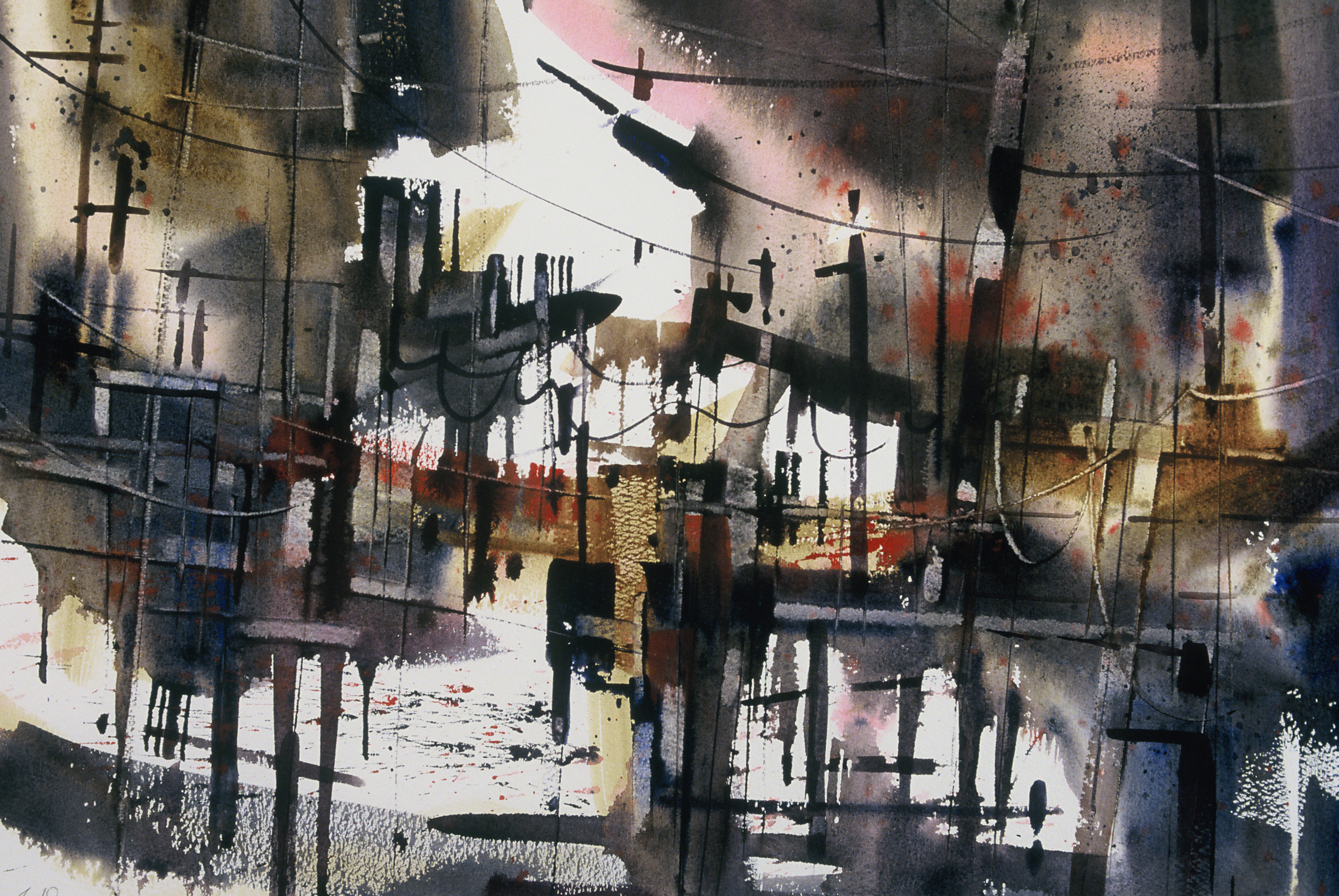
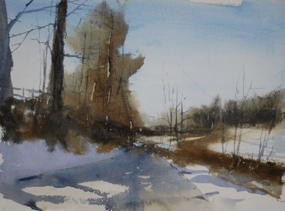
Watercolor Step by Step: Moving White Shape
Change colors for a different effect
Creative Jumpstarts: Ah to be an Artist
Improve your brushwork, improve your paintings
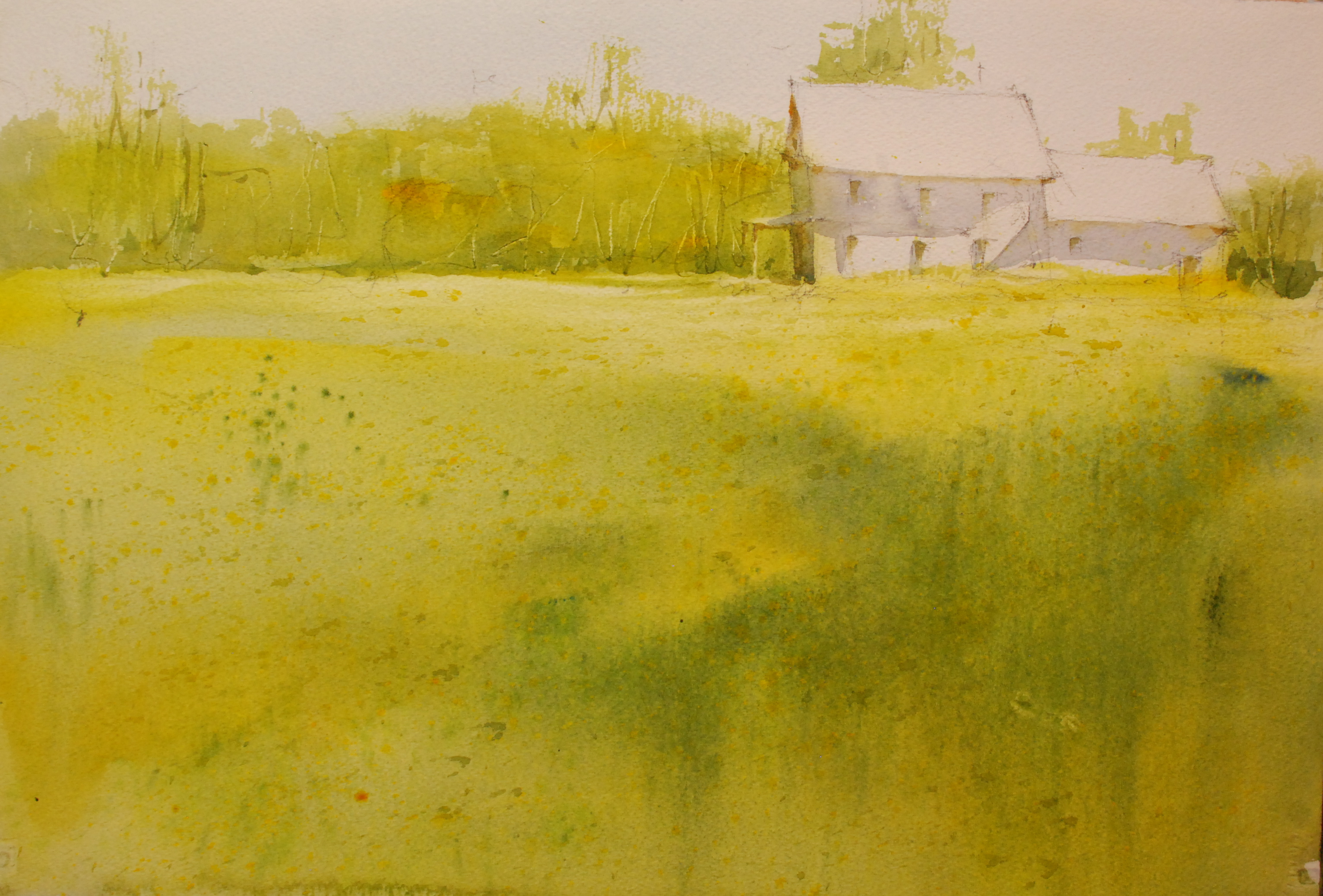
Light and Shadow, Watercolor Demonstration
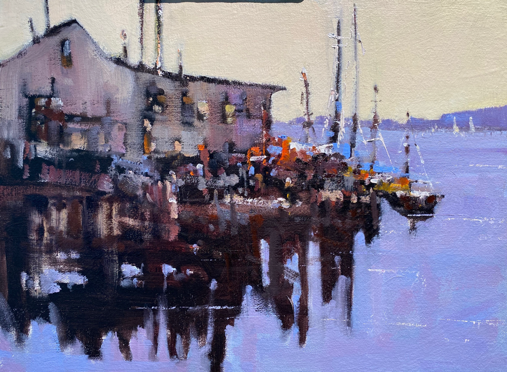
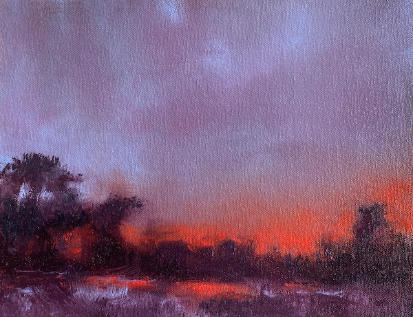
In the studio: An oil lesson in tonalism
In The Studio: Edit the image to make a better painting
In the studio: What is your idea, keep it simple
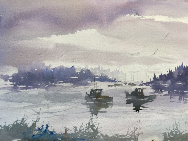
Painting Pemaquid Point
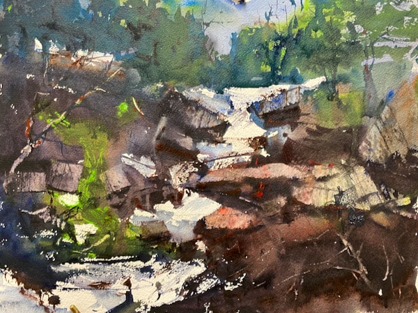
In the studio: A lesson on thinking in shape
In the Studio: Welcome Back to my Blog
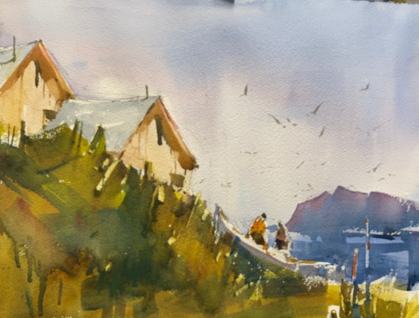
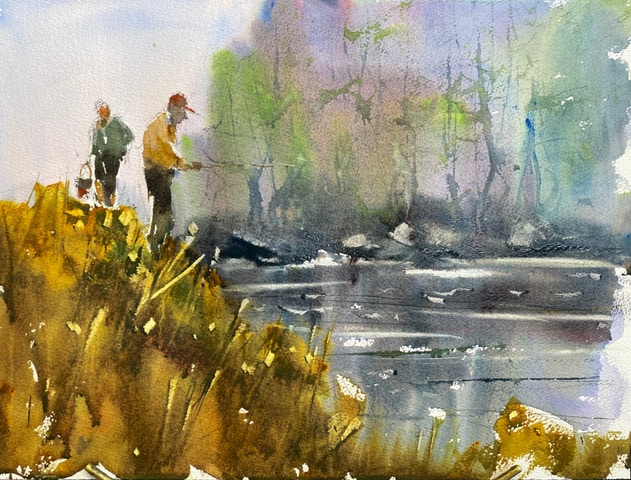
Figures Fishing in Watercolor
Posts pagination
1
2
…
48
Next Page
»