
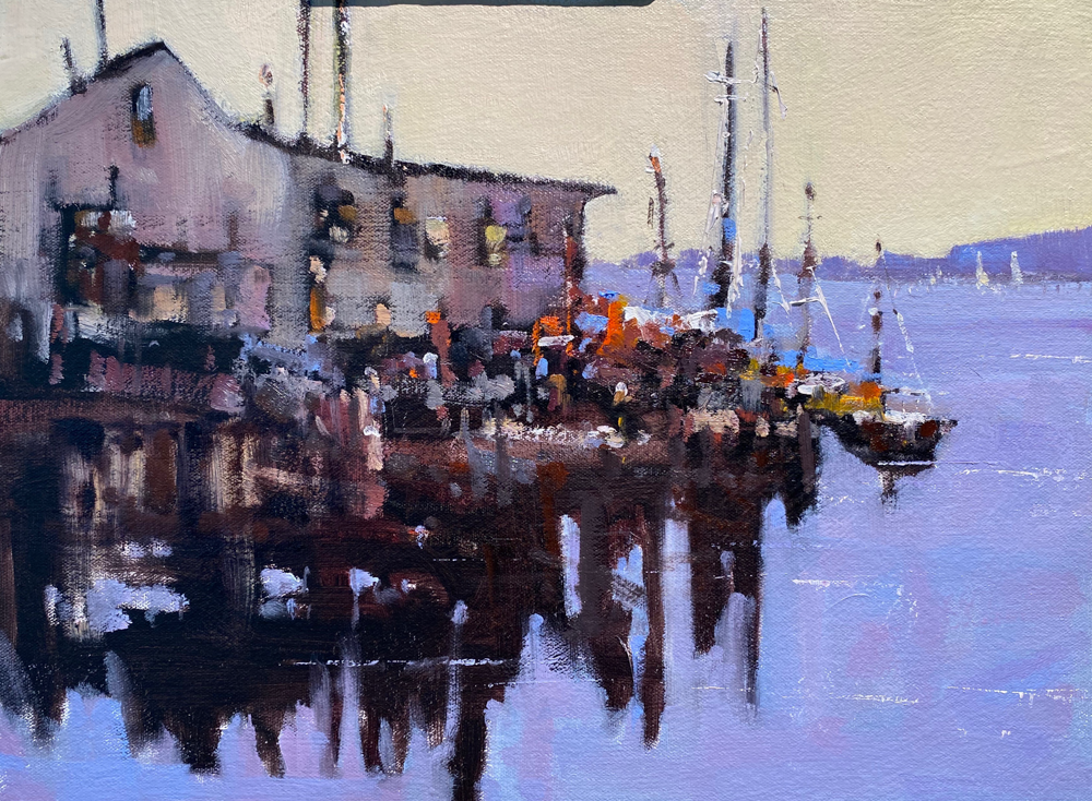
 Well okay so I painted the scene again and I guess it is an improvement. I opened up the white pattern and created more movement, and the buildings are not dark and dreary. BUT I still think it is not working the way I want it to. Colors started breaking into red, yellow, green, red, yellow, green and that usually doesn’t lead to a positive result, and again the building although better are not lighting my fire. It is a nice colorful painting with and interesting point of view and has some nice application of paint and brushwork and I do think the shapes are nice. All in all I am glad I worked on it again but I think I will move on.
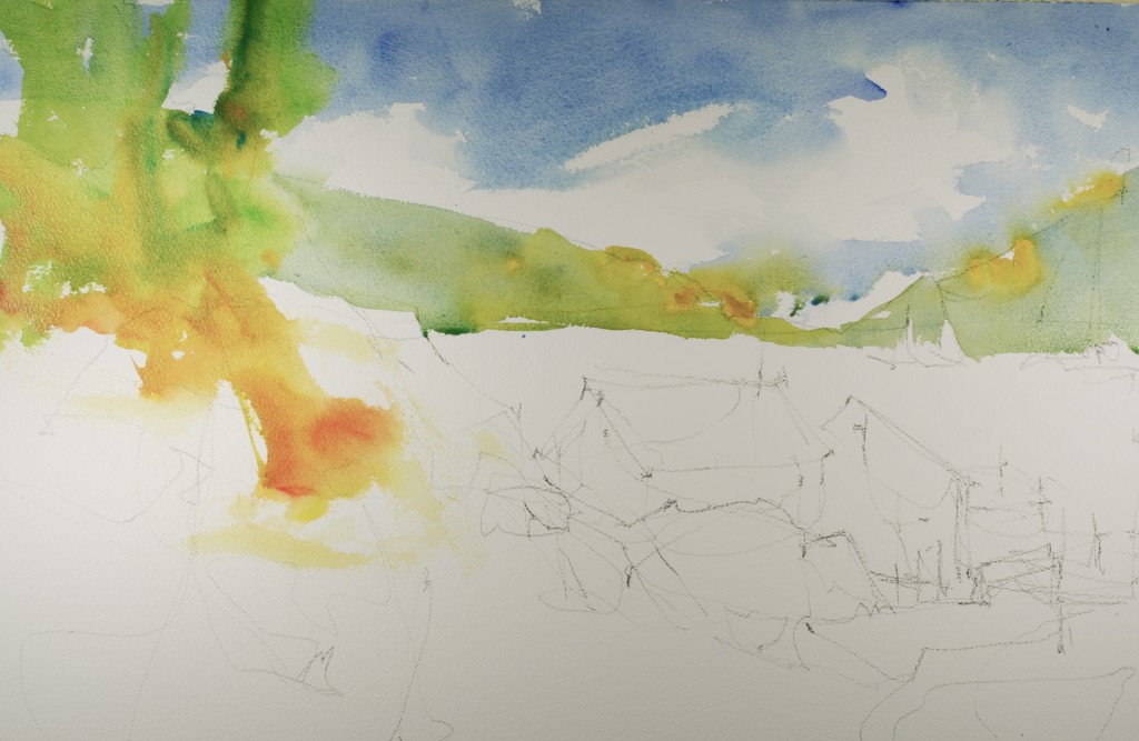 Use cobalt and cerulean for the sky and really have a nice diagonal feeling with your brush work soften some of the edges with the side of your brush. Immediately paint in the distant hills with hansa yellow, cerulean blue and cobalt blue.
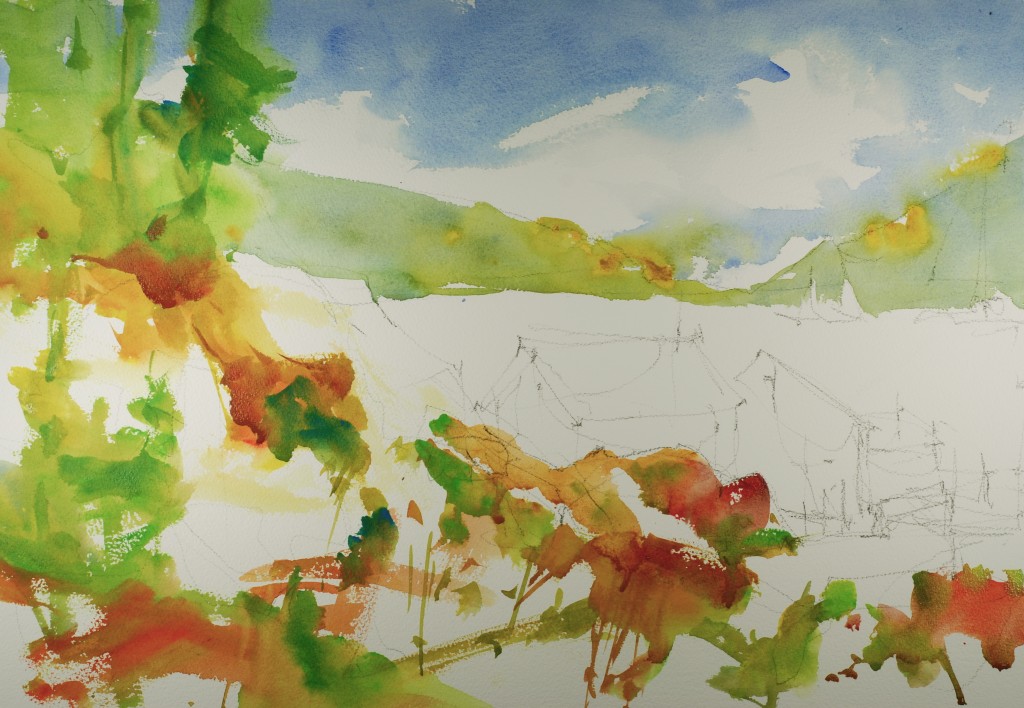
Without letting the sky wash dry begin on the trees with thalo yellow green, cerulean blue and hansa yellow. Carry this green color into the foreground introducing burnt sienna, raw sienna and cadmium scarlet. Try to get lots of variety and movement, and remember the painting will be successful if you leave wonderful white passages of paper.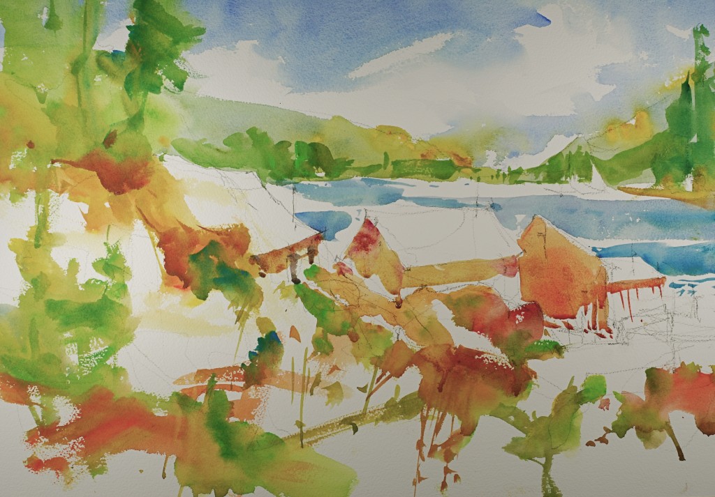
Paint in the shadow shapes on the building using raw sienna, cobalt violet and some cobalt blue to grey the mixture. Make each building slightly different from the other buildings, This is where I really didn’t get it done as well as I would have liked.Paint in details, and some accents like windows, doors, and boats in the distance. I hope you are enjoying this daily painting blog, I am having fun putting in out although I will tell you that it is work and takes a little commitment. Let me know what you think.
Steve, thanks for explaining what you wanted to correct when you repainted this–it is a great reminder for us to have a plan when we paint, not just a “scene.” This has a wonderful summery feel-it’s not always easy to use these colors without it turning into a wimpy mess. Love the foreground–the white space really leads the eye into the painting, and the splashes of red and green plants remind me of wild strawberries!
Dear Steve, I don’t know if you read this comment in a post of yours in 2013, I hope so. I would like I´d read it then, but I met you in July 2013 and this is earlier. Now I’m reading them and enjoying them very much, and especially learning so much from them. I’m also reading to other artists but I prefer you and your work. The work today is super, and I’ve learned to repeat it until get it, as you do. Thank you for sharing.