
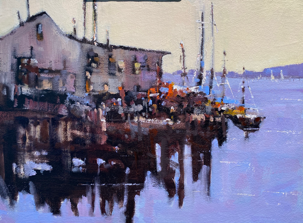
 This painting has a lot of energy and movement both in the brushwork and in the well designed white shape that moves through the painting. Unless you are a color painter it is a good idea to consider using a strong value contrast to move the viewer through your painting. Take a few minutes and design this before painting. The success of a painting is not about capturing exactly what the camera gives you but how well you as the creative soul interprets the information and expresses your reaction. Along the white shapes I put texture and color to entertain the viewer and to work the eye along the shape. Give it a go and you will be more successful.
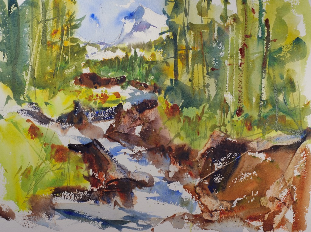
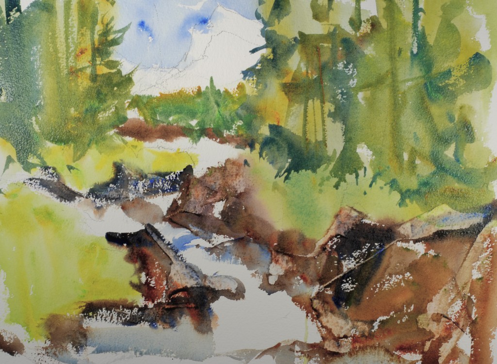
 Using cobalt and ultramarine blue I painted the sky pulling the blue behind the trees. I then used hansa yellow, new gamboge and skips green from American Journey for a bright green follage.
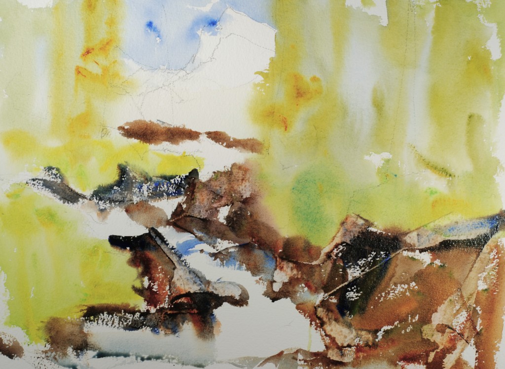 Without waiting for the greens to dry I used a varied mixture of burnt sienna, ultramarine blue, alizirin, and olive green to paint dark rocks. I scraped the tops of the rocks with a flat knife.
 I overbrushed some darker trees shapes using a mixture of ultramarine blue and new gamboge.
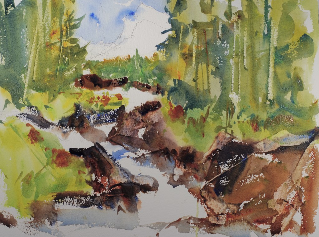 I painted a few darker pieces of green weeds in the foreground
 Using cobalt blue, cobalt violet and burnt sienna I painted in the mountain peaks.
I finished off the painting with some water movement and foreground details and a few tree trunks. I hope you enjoy this painting is was a lot more fun than some I have painted.
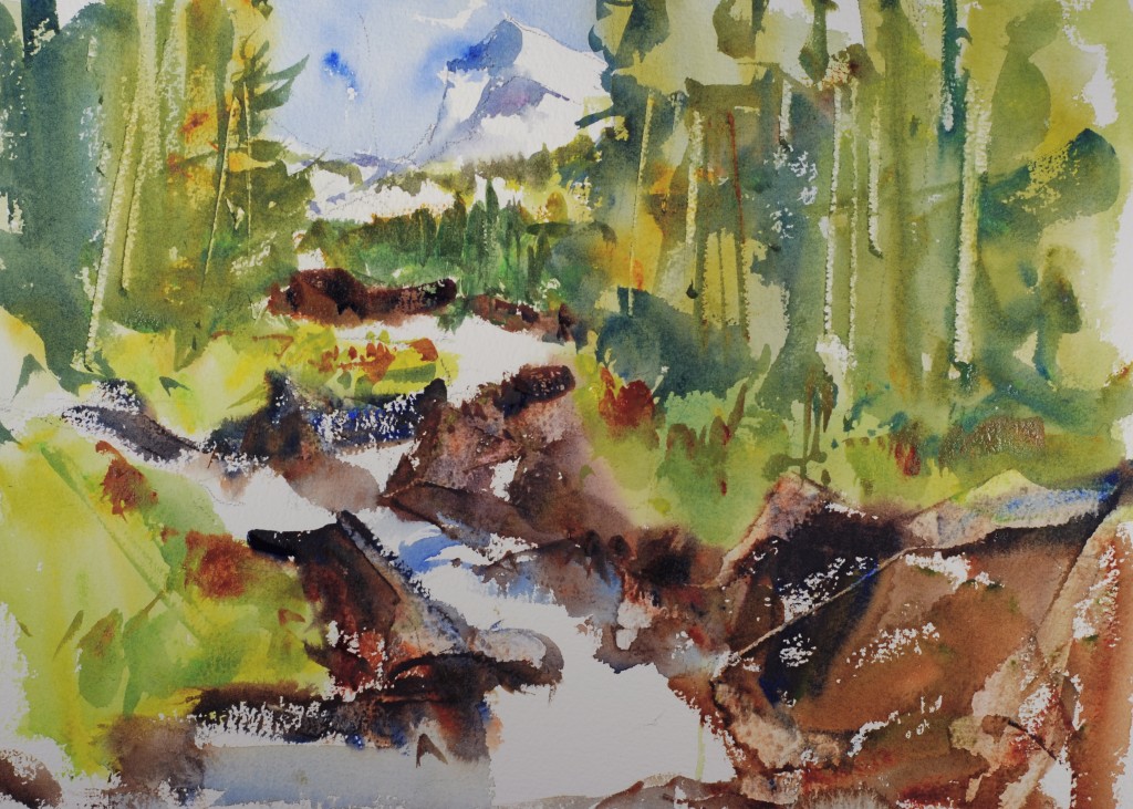
Not sure I painted Paradise, but between this painting and your instructions for #85, my mountains look better and the white paper is a little better defined. Yes, it helps to have a value pattern!